Brand identity design for businesses that need clarity.
PIXEL SHAKE develops distinctive brand identities for businesses that need a clearer, more professional and consistent presence across digital and print.
A strong identity makes your business easier to
recognise.
understand.
trust.
A brand identity is more than a logo. It brings together typography, colour, composition and visual rules so your business presents itself clearly and consistently wherever people encounter it. When these elements work as one system, customers understand more quickly who you are, what you offer and why your business feels credible.
01
Clarity
A clear visual direction helps people understand your business, your positioning and the value you provide.
02
Consistency
A defined system keeps your website, presentations, social media and printed materials visually connected.
03
Recognition
Distinctive and repeated visual elements make your business easier to remember and recognise over time.
From Idea to identity
Original brands don't start with a template.
Every brand identity starts with understanding what makes the business different. From there, I explore ideas, shapes, typography and visual relationships until a direction begins to feel unmistakably its own.
Some of the strongest ideas still begin on paper. Sketching removes distraction and creates space to think before anything is polished digitally. The selected direction is then refined into a precise visual system designed to work across digital and print.
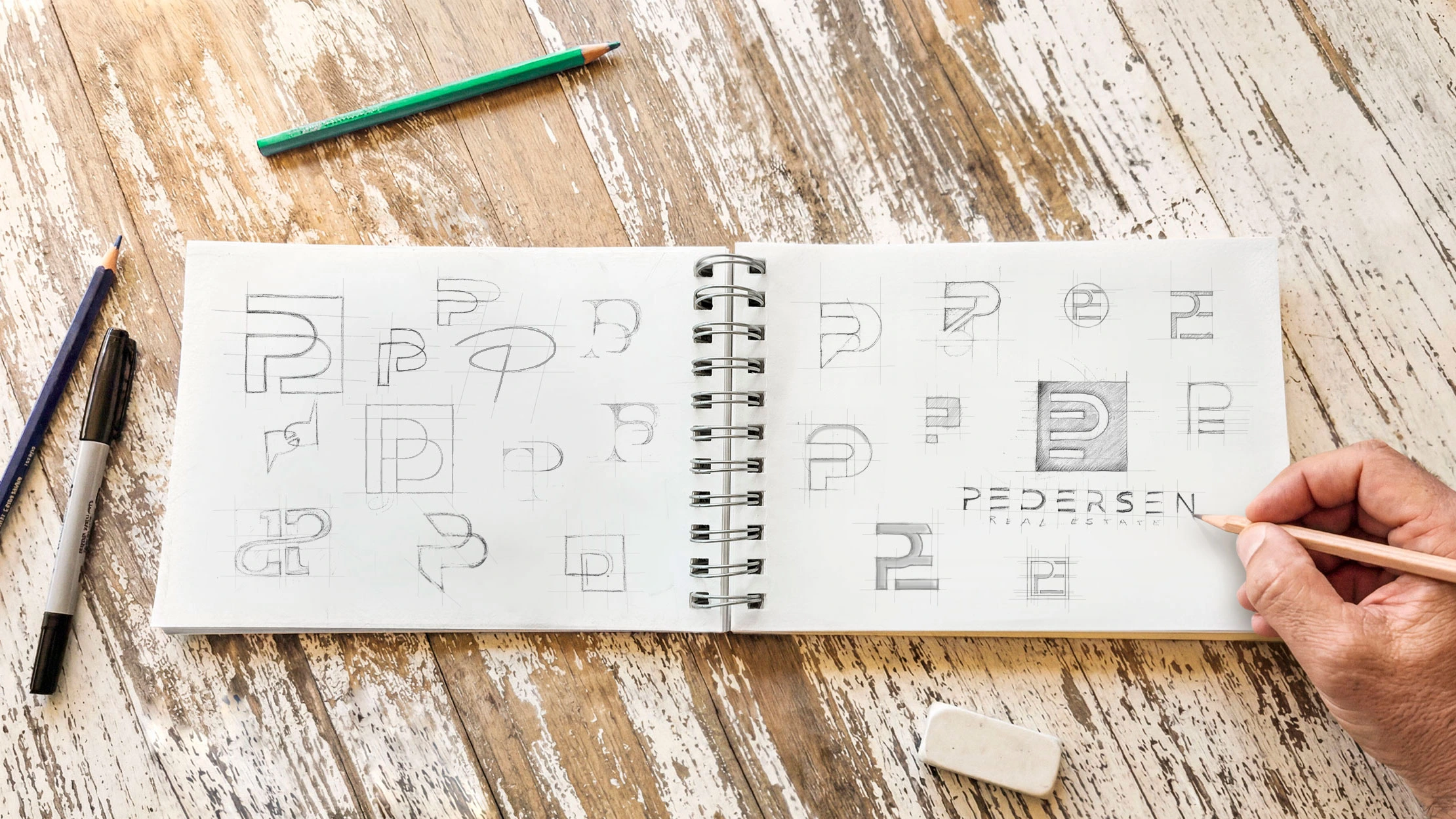
Human thinking — Hand-drawn exploration — Precise digital execution.
More than a logo. One visual system.
A logo is one part of an identity. The real strength comes from the system around it: typography, colour, composition and visual elements that make your business recognisable wherever it appears.
01
LOGO & BRAND MARKS
Distinctive logo systems and visual marks designed to work across different formats, sizes and applications.
02
TYPOGRAPHY
A considered type system that gives your brand character, structure and a consistent visual voice.
03
COLOUR SYSTEM
04
VISUAL LANGUAGE
Shapes, graphic elements, imagery and composition that extend the identity beyond the logo itself.
05
LAYOUT PRINCIPLES
06
BRAND GUIDELINES
the process
A clear path from first idea to final identity.
Every project is different, but the process follows a clear structure. You always know what we are working on, why decisions are being made and what comes next.
Understand
We define your business, audience, positioning, goals and the impression your brand needs to create.
Explore
I develop ideas through research, hand sketching, typography and composition, then select the three strongest logo directions for further development.
Present
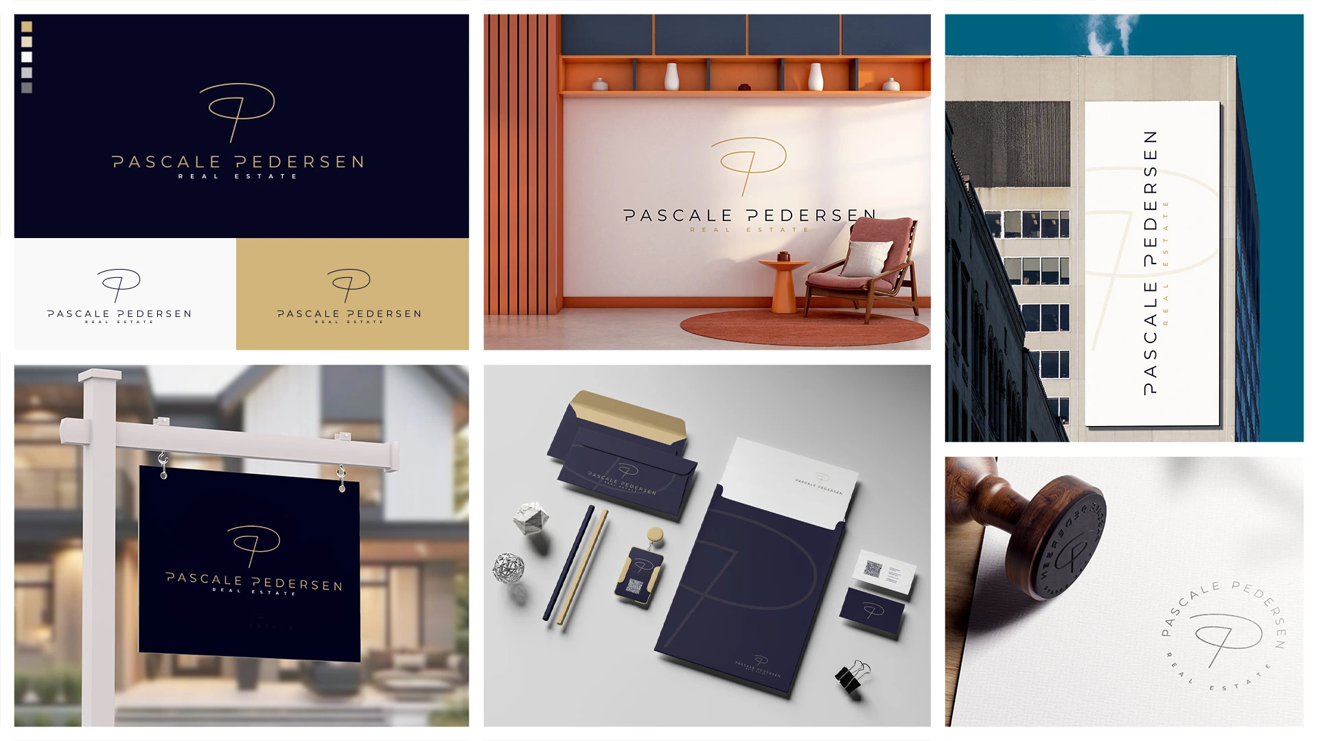
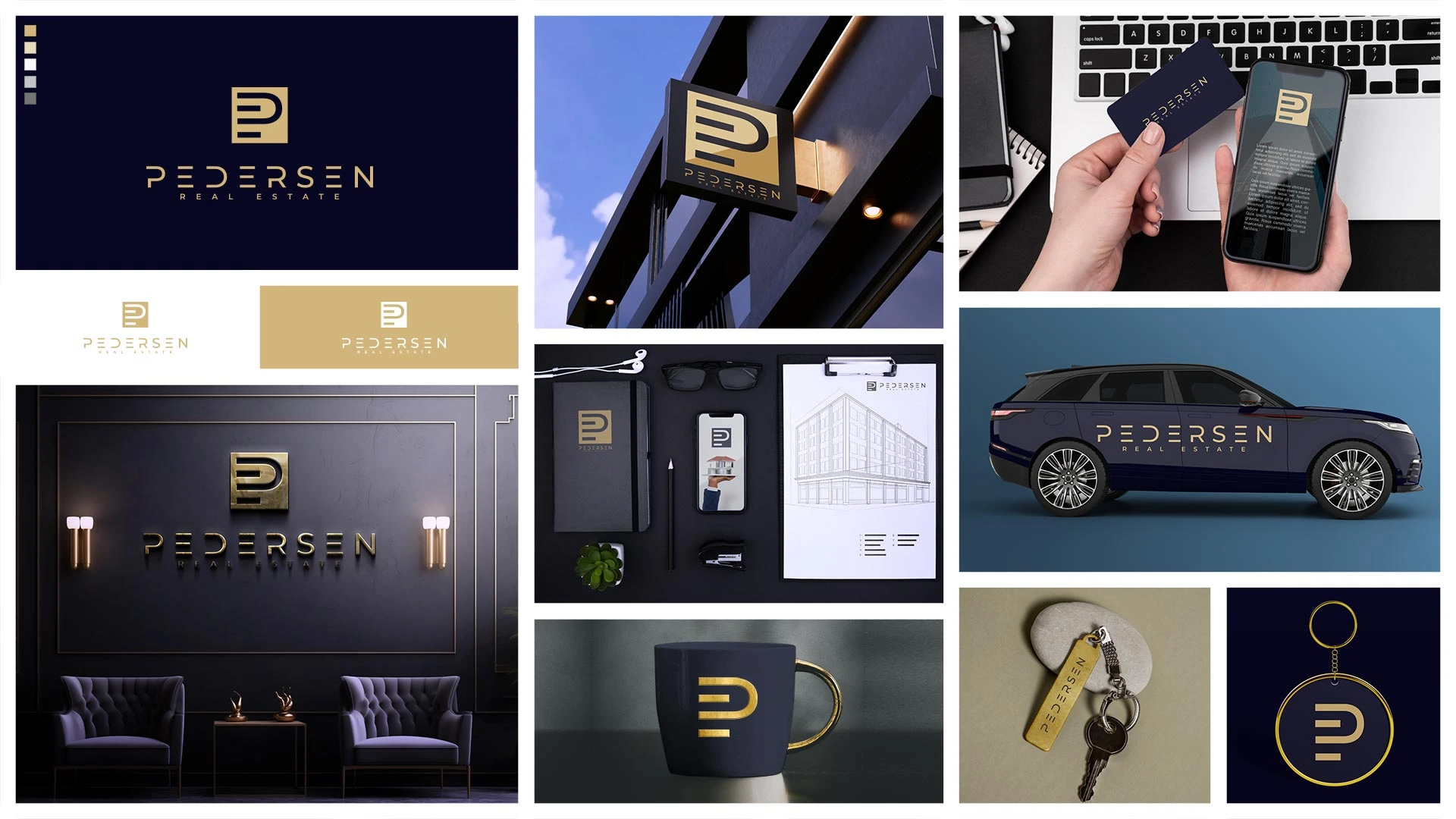
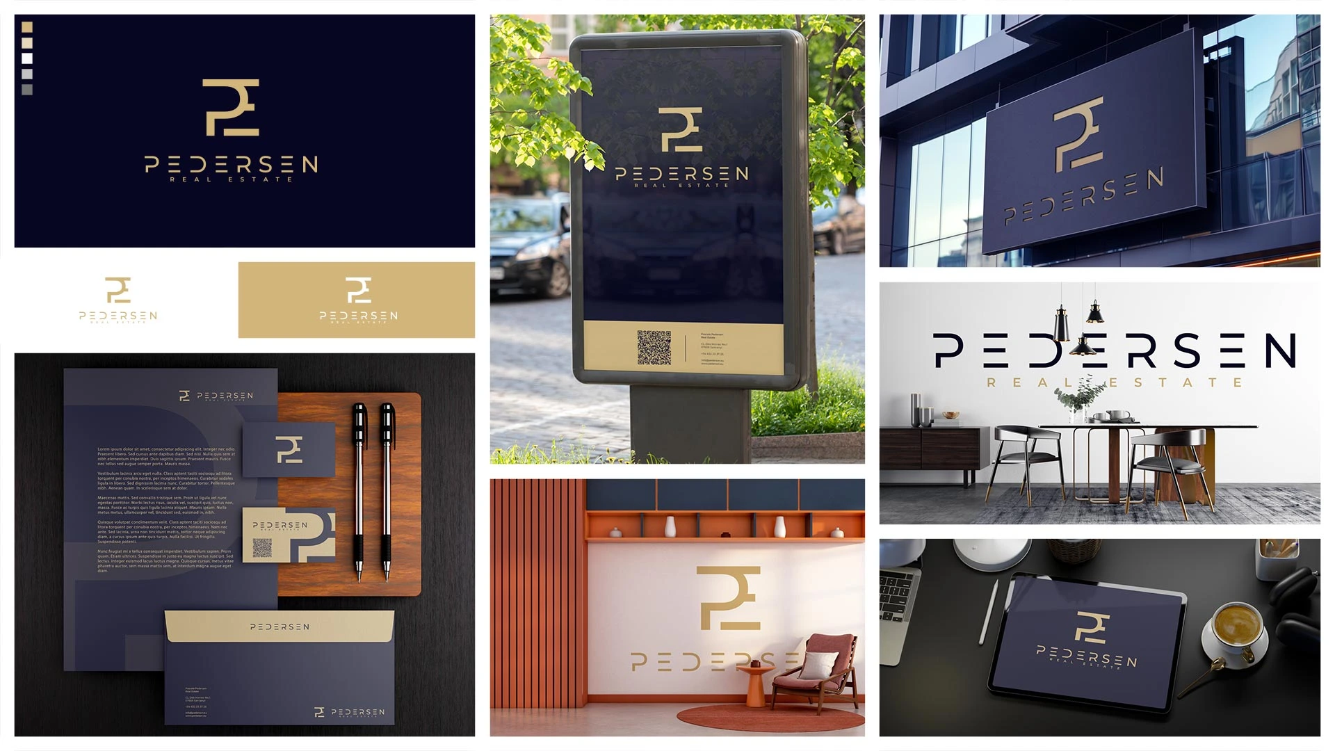
Each of the three selected concepts is developed beyond the logo, with an initial colour direction and selected brand applications so you can evaluate how each identity could work in real use.
Refine & Build
Once a direction is chosen, the logo, colour system, typography and visual rules are refined and prepared for consistent use across digital and print.
THREE DIRECTIONS
See the identity before you choose it.
Rather than presenting isolated logos, I develop the three strongest directions far enough to show how each could work as a real brand. Initial colour choices and selected applications make the differences between the concepts easier to evaluate.
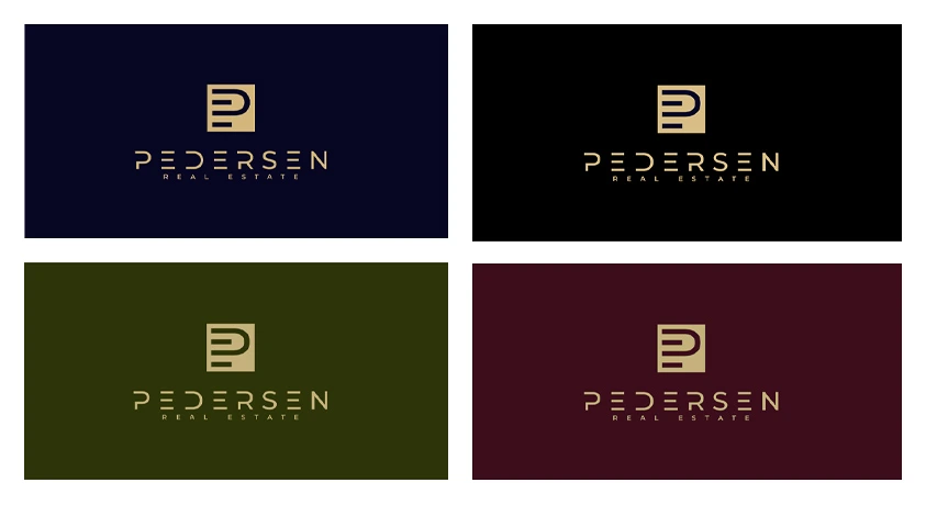
COLOUR SELECTION
Defining the final colour direction.
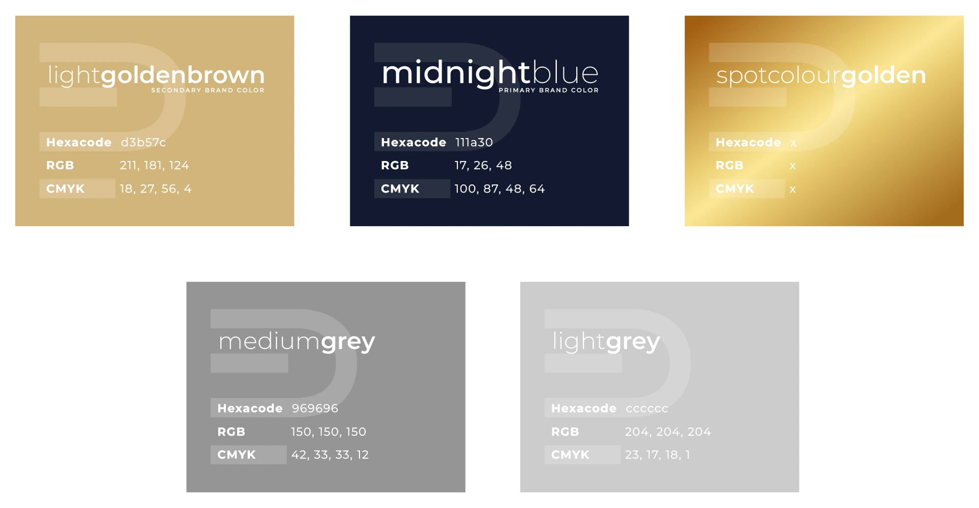
BRAND COLOUR PALETTE
Built for consistent use.
Logo colour rule: Gold PE icon — Light Golden Brown PEDERSEN wordmark on dark backgrounds.